“Sell Outcomes, Not Features” Is Good Advice Until It Isn’t
SaaS founders are often given the same messaging advice:
Sell outcomes, not features.
The reasoning makes sense. Customers don’t buy software because they want another dashboard, AI feature, or integration. They buy because they want to solve a problem or achieve a better result.
But taken too far, this advice can create another problem.
A homepage can become so focused on broad outcomes that visitors struggle to understand what the product actually does, where it fits into their workflow, or why they should choose it over dozens of alternatives making similar promises.
“Improve productivity.”
“Deliver better experiences.”
“Transform your workflow.”
These statements communicate desirable outcomes. But they could also describe hundreds of different SaaS products.
That’s what makes the evolution of LogRocket’s homepage messaging interesting.
An earlier version of the homepage led with:
“Stop Guessing About Your Digital Experience.”
The current homepage is considerably more specific:
“AI session replay that catches issues before your users do.”
At first glance, the newer headline might appear more feature-focused.
But the more interesting change is not that LogRocket moved from outcomes to features.
It’s that the current messaging creates a tighter connection between what the product is, what it does, and why the buyer should care.
And that distinction has an important lesson for SaaS founders trying to improve their own homepage messaging.
The Earlier Homepage: A Strong Problem, but a Broad Promise
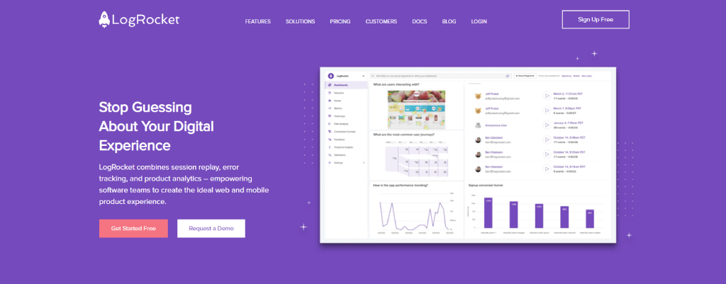
The earlier LogRocket homepage opened with:
“Stop Guessing About Your Digital Experience.”
The supporting copy explained that LogRocket combined session replay, error tracking, and product analytics to help software teams create better web and mobile product experiences.
There’s a lot that works here.
“Stop guessing” addresses a recognizable problem.
Product and engineering teams need visibility into what users are experiencing, where friction occurs, and what needs to be fixed.
The supporting copy then explains the capabilities behind the promise: session replay, error tracking, and product analytics.
The messaging follows a logical structure:
Problem → Product capabilities → Desired outcome
But there is a potential weakness.
“Digital experience” is an extremely broad concept.
Is LogRocket primarily helping teams identify bugs?
Understand user behavior?
Improve UX?
Analyze product performance?
Find conversion friction?
The supporting copy provides more context, but the visitor still has to connect several capabilities to understand exactly where LogRocket fits into their workflow and what makes the product particularly valuable.
The final promise of helping teams create the “ideal web and mobile product experience” is desirable, but similarly broad.
This doesn’t mean the earlier homepage was ineffective.
Without access to LogRocket’s conversion data, visitor research, or internal testing, there’s no way to make that claim from the outside.
What we can observe is that the messaging asked visitors to make a relatively large mental jump:
From “stop guessing about your digital experience”
to understanding exactly how LogRocket helps them do that and why its approach matters.
The Current Homepage: Specificity Without Losing the Outcome
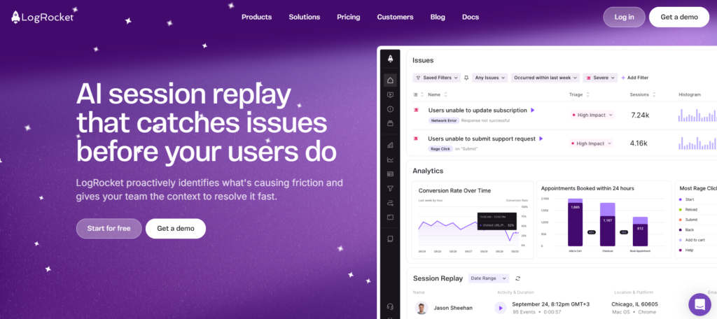
The current LogRocket homepage takes a noticeably different approach.
The headline now reads:
“AI session replay that catches issues before your users do.”
And the supporting copy continues:
“LogRocket proactively identifies what’s causing friction and gives your team the context to resolve it fast.”
The difference is subtle, but strategically important.
LogRocket now immediately tells visitors what the product is:
AI session replay.
Then, instead of stopping at the product category, the headline connects that capability to a specific outcome:
Catching issues before users do.
The supporting copy continues the same narrative.
LogRocket identifies friction.
It gives teams the context behind the problem.
And it helps them resolve the issue faster.
The messaging creates a much tighter sequence:
Product → Problem → Context → Resolution
There’s less work left for the visitor to do.
They don’t have to start with a broad promise about improving digital experiences and then determine how session replay, error tracking, and product analytics work together to deliver that outcome.
The relationship between the product and its value is presented directly.
What makes this even more interesting is the product visual accompanying the new message.
The interface shows specific issues such as users being unable to update subscriptions or submit support requests, alongside severity levels, affected sessions, analytics, and session replay data.
The visual isn’t simply showing that LogRocket has a sophisticated product.
It is demonstrating the promise made by the headline.
The headline says LogRocket catches issues.
The supporting copy explains that teams receive the context needed to resolve them.
And the product visual shows what identifying and investigating those issues actually looks like.
That alignment creates a much more focused above-the-fold narrative.
But the most important lesson isn’t that every SaaS company should make its homepage more product-focused.
It’s that specificity and outcomes don’t have to compete.
LogRocket’s current headline communicates both.
It tells visitors what the product is while immediately connecting that product to a problem they already care about solving.
What Actually Changed: From a Broad Outcome to a Tighter Value Narrative
The most interesting part of LogRocket’s messaging shift is that neither homepage follows the simplistic “features versus outcomes” framework.
The earlier version was already outcome-oriented.
It addressed the problem of teams “guessing” about their digital experience, introduced LogRocket’s capabilities, and connected them to the broader goal of creating better web and mobile products.
The current homepage doesn’t abandon outcomes and start selling features instead.
It simply tightens the relationship between the product and the result.
The earlier narrative follows this structure:
Broad problem → Multiple capabilities → Broad outcome
Stop guessing about your digital experience → session replay, error tracking, and product analytics → create the ideal product experience.
The current narrative is more direct:
Specific product → Specific capability → Specific outcome
AI session replay → proactively identify friction → understand the context → resolve issues faster.
The difference is the amount of interpretation required from the visitor.
In the earlier version, visitors need to understand how three different capabilities work together and connect them to the broader idea of improving digital experiences.
The current version makes that relationship more explicit.
You know what the product is.
You know what problem it identifies.
You know why identifying that problem matters.
And you know what your team can do next.
This is an important distinction for SaaS founders.
The goal of homepage messaging isn’t necessarily to remove features and replace them with bigger outcomes.
It’s to reduce the distance between what your product does and why your buyer should care.
The Overlooked Problem With Outcome-Driven Messaging
“Sell outcomes, not features” remains useful advice.
The problem begins when SaaS companies interpret it as:
Make the product less specific and the promise bigger.
That’s how homepages end up with headlines like:
Transform the way your team works.
Unlock better customer experiences.
Drive smarter business growth.
These statements sound ambitious.
They’re also difficult to associate with any specific product.
A project management platform could promise to transform the way teams work.
So could an AI assistant.
A CRM.
An automation platform.
Or an internal communication tool.
The outcome might be desirable, but the visitor is still left asking:
How exactly does this product help me achieve it?
That creates a different kind of messaging friction.
The visitor doesn’t necessarily lack interest in the outcome. They lack a clear mental model of the product’s role in creating it.
LogRocket’s current homepage offers an interesting alternative.
“AI session replay that catches issues before your users do.”
The headline doesn’t force visitors to choose between understanding the product and understanding the outcome.
It gives them both.
What is it?
AI session replay.
What does it do?
Catches issues.
Why should I care?
Your team can identify and address those issues before they create a worse experience for users.
The lesson isn’t that every SaaS headline should follow this exact formula.
Different products, markets, and levels of buyer awareness require different messaging strategies.
The lesson is that specificity can strengthen an outcome rather than weaken it.
Sometimes the strongest value proposition isn’t the biggest promise you can make.
It’s the one that requires the least interpretation from the right buyer.
Three Lessons SaaS Founders Can Take From LogRocket’s Messaging Shift
1. Don’t Make Visitors Choose Between Understanding the Product and Understanding the Value
A feature-only headline can explain what the product does without giving visitors a reason to care.
A broad outcome-only headline can communicate an attractive result without helping visitors understand how the product delivers it.
Neither extreme is automatically better.
The stronger question is:
Can the right visitor quickly understand what the product does and connect it to a problem they already care about?
If that connection requires several paragraphs of supporting copy, the headline may be leaving too much work for the visitor.
2. Reduce the Distance Between the Problem and the Product
The earlier LogRocket homepage addressed a broad problem:
“Stop Guessing About Your Digital Experience.”
The current version connects the product much more directly to a specific problem:
“AI session replay that catches issues before your users do.”
This creates a shorter path from understanding the product to recognizing its value.
SaaS founders can apply the same test to their own homepage.
Look at your headline and ask:
How many assumptions does a first-time visitor have to make before they understand why this product matters?
Do they immediately see the connection?
Or do they need to read several sections, interpret multiple features, and assemble the value proposition themselves?
The more interpretation required, the greater the possibility that visitors leave before fully understanding the product.
3. Make the Product Visual Prove the Message
One of the strongest parts of LogRocket’s current hero isn’t the headline alone.
It’s the relationship between the headline, supporting copy, and product visual.
The headline promises to catch issues.
The supporting copy explains that LogRocket identifies friction and provides the context needed to resolve it.
The interface then shows actual issues, affected sessions, severity levels, analytics, and session replay information.
Each element reinforces the same narrative.
This is particularly important for SaaS websites.
Many companies place a dashboard screenshot in the hero simply because they want visitors to see the product.
But a product visual can do more than prove that the software exists.
It can provide evidence for the value proposition.
If your headline promises faster workflows, does the visual help visitors understand how the product makes those workflows faster?
If you promise better visibility, does the interface demonstrate what that visibility looks like?
If you promise to reduce manual work, can visitors see what is being automated?
A strong hero doesn’t require the headline, supporting copy, and product visual to communicate three different things.
It uses all three to make one central idea easier to understand.
Features vs. Outcomes Is the Wrong Debate
The evolution of LogRocket’s homepage messaging highlights a problem with one of the most common pieces of SaaS copywriting advice.
The question shouldn’t simply be:
Should we sell features or outcomes?
Both can create messaging problems when taken too far.
Lead only with features, and visitors may understand the product without understanding why it matters.
Lead only with broad outcomes, and visitors may like the promise without understanding what the product actually does or how it delivers that result.
The stronger approach is to reduce the distance between the two.
LogRocket’s current homepage does this by connecting a recognizable product category “AI session replay” to a specific problem: catching issues before users do.
The supporting copy then continues the same narrative by explaining how teams can identify friction, understand the context behind it, and resolve issues faster.
The product visual reinforces that promise rather than introducing another message.
The result is a tighter relationship between:
What the product is.
What problem it solves.
Why the buyer should care.
That doesn’t mean LogRocket’s current homepage necessarily converts better than the earlier version.
Only LogRocket’s internal data could answer that question.
But from a messaging perspective, the shift offers a useful lesson for SaaS founders.
The goal isn’t to write the biggest promise possible.
It isn’t to remove every mention of features from the homepage.
And it isn’t to follow a universal headline formula.
The goal is to help the right visitor understand the relationship between your product and their problem without making them connect the dots themselves.
Sometimes, better SaaS messaging isn’t about saying less.
It’s about reducing how much interpretation your buyer has to do.
Is Your Homepage Making Visitors Connect the Dots?
Your product may be clear to your team.
That doesn’t necessarily mean it’s clear to someone discovering it for the first time.
When you work closely with a product every day, it becomes easy to assume visitors understand how its features connect to the problems they’re trying to solve.
Sometimes they do.
Sometimes the homepage leaves them doing more interpretation than you realize.
Without looking at visitor behaviour and conversion data, no outside analyst can know for certain whether that’s affecting your conversions.
But an independent review can help identify the messaging questions worth investigating.
I analyze SaaS websites from the visitor’s perspective to identify where messaging, value propositions, and page structure may be creating unnecessary friction in the buying journey.
Not sure whether your homepage is communicating your product as clearly as you think?