Ruddr has built a Professional Services Automation (PSA) platform with a website that emphasizes clarity, trust, and a structured buying journey. In this breakdown, we’ll analyze how its messaging, design, user experience, and conversion strategy guide visitors from awareness to trial and where there are still opportunities to strengthen conversions.
Unlike a homepage review, this analysis evaluates how the entire website works together from navigation and messaging to supporting pages and conversion paths to influence buying decisions.
Who will benefit from this breakdown?
This breakdown is for:
- SaaS founders looking to improve website conversions
- Product marketers refining positioning and messaging
- Designers focused on UX and landing page structure
- Growth teams optimizing demo and trial signups
- Anyone interested in how B2B SaaS websites turn visitors into customers
Website Snapshot
| Category | Rating |
| Messaging & Positioning | 8.5/10 |
| Information Architecture | 9.3/10 |
| Product Demonstration | 9.4/10 |
| Trust & Credibility | 9.2/10 |
| Conversion Strategy | 8.7/10 |
| Overall Buying Experience | 9.1/10 |
⭐ Overall Rating
9.1 / 10
A cohesive website ecosystem that consistently supports buyers from initial discovery through deeper evaluation.
🟢 Biggest Strength
A connected buying journey.
Homepage, product pages, integrations, customer stories, documentation, and conversion paths work together rather than functioning as isolated pages.
🟠 Biggest Opportunity
Make the business value more immediate.
Stronger differentiation, earlier customer outcomes, and clearer trial expectations could help buyers reach confidence faster.
Company Overview
What Ruddr Does
Ruddr is a Professional Services Automation (PSA) platform built for consulting firms, software development agencies, IT service providers, and other professional services businesses. The platform helps teams manage projects, resources, time tracking, invoicing, forecasting, and integrations from a single workspace.
Rather than positioning itself as another project management tool, Ruddr focuses on helping professional services organizations improve operational efficiency, resource planning, and profitability.
First Impression (Above the Fold)
Overall Impression
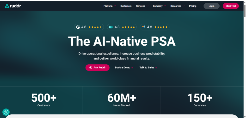
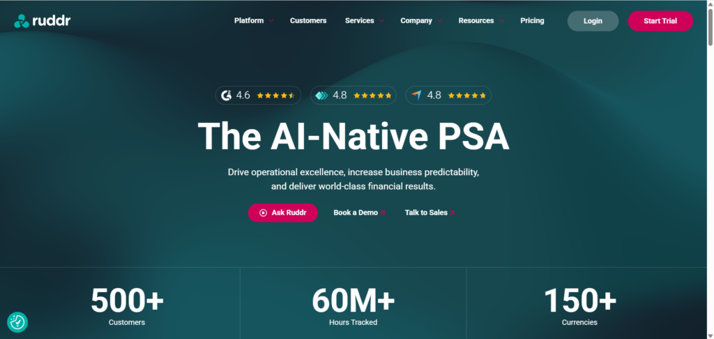
The first impression is strong. Within a few seconds, visitors can identify that Ruddr serves professional services organizations rather than the broader project management market.
The navigation is clean, CTAs are immediately visible, and the design feels modern without relying on unnecessary animations or visual distractions.
The homepage establishes professionalism early, which is particularly important for enterprise and B2B buyers.
What Works Well
✔ Clear navigation
✔ Strong visual hierarchy
✔ Professional color palette
✔ Immediate CTA visibility
✔ Modern interface
Opportunities
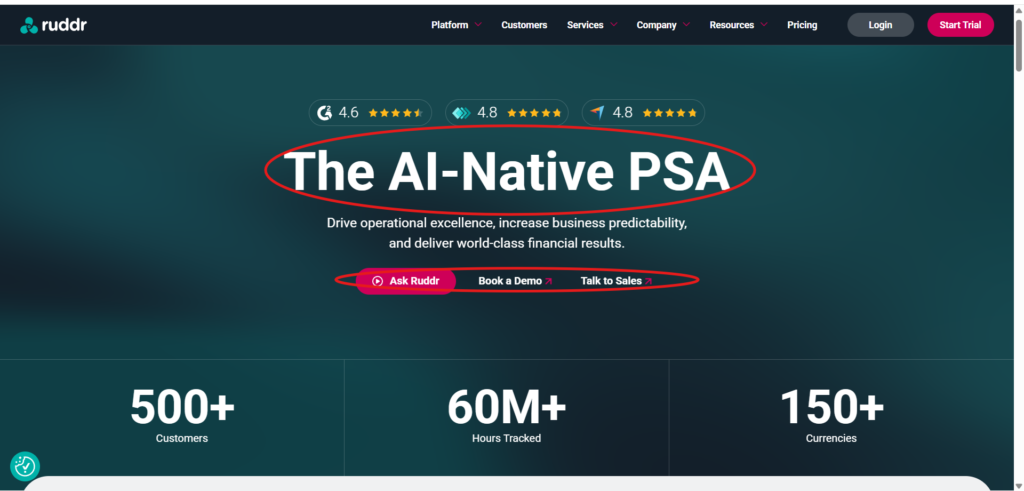
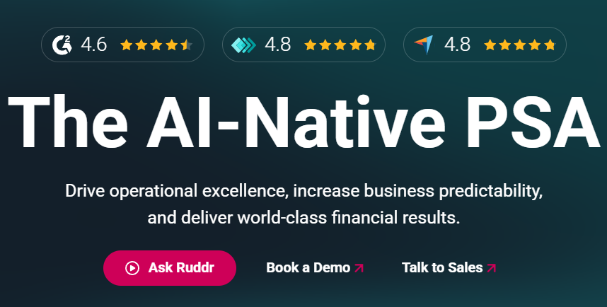
While visually polished, the hero headline focuses more on the product category than the business outcome.
A more outcome-driven headline could communicate the value proposition even faster by highlighting measurable business results instead of simply introducing the platform.
Messaging & Positioning
What Ruddr Communicates Well
One of Ruddr’s biggest strengths is consistency.
Across the homepage, integration pages, documentation, onboarding content, and customer stories, the messaging consistently reinforces that Ruddr is built specifically for Professional Services Automation.
Instead of trying to appeal to every business, the website speaks directly to agencies, consultancies, and service organizations. That narrow positioning makes the messaging feel more credible and immediately relevant to its target audience.
The site also avoids excessive technical jargon. Most copy explains product capabilities in terms of business workflows, making it accessible to both decision-makers and operational teams.
Where the Messaging Could Improve
Although the positioning is clear, the differentiation is less obvious.
Visitors quickly understand what Ruddr is, but they may need to spend more time discovering why Ruddr is a better choice than competing PSA platforms.
The messaging would be stronger if the website introduced its unique competitive advantage earlier in the buying journey with a concise positioning statement that answers:
Why should I choose Ruddr over every other PSA platform?
That distinction becomes clearer deeper in the site through customer stories and feature pages, but surfacing it earlier would strengthen the overall conversion experience.
Homepage User Journey
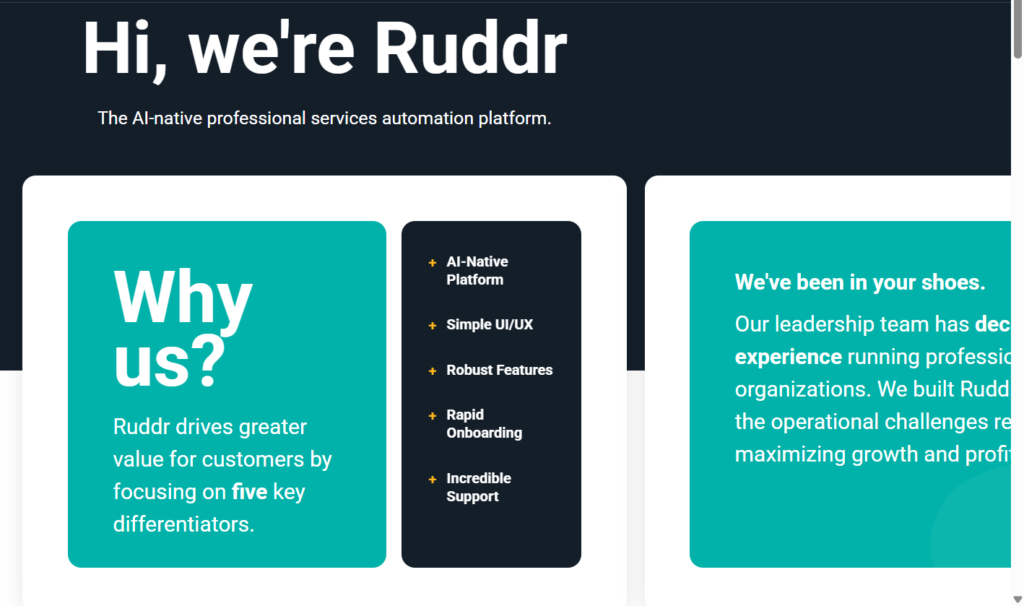
A strong homepage doesn’t just present information, it guides visitors through a logical decision-making process. Ruddr does this well by answering key questions in the order a potential customer is likely to ask them.
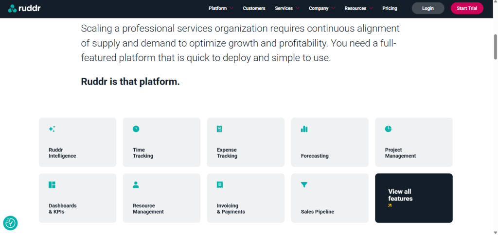
The journey begins by introducing the product and its purpose before gradually expanding into product capabilities, integrations, onboarding services, customer success stories, and clear calls-to-action. Instead of overwhelming visitors with every feature upfront, the homepage progressively builds understanding and confidence.
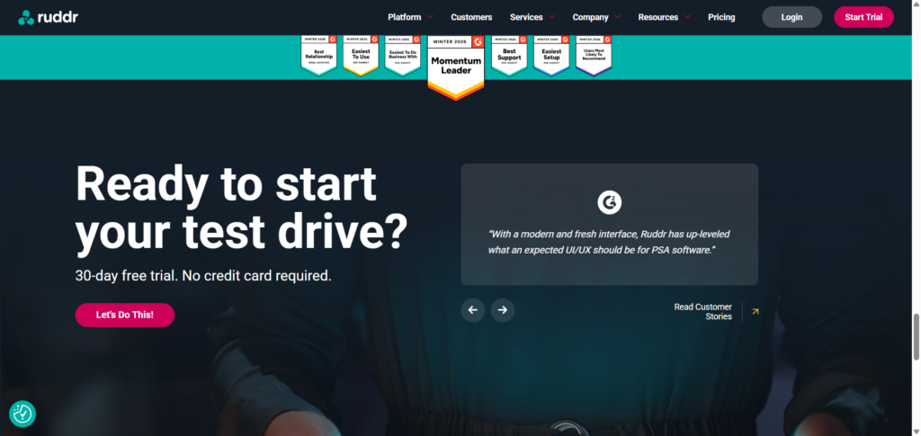
Another strength is the consistency of CTAs throughout the page. Visitors are given multiple opportunities to start a trial or learn more without the experience feeling repetitive or overly sales-focused.
While the overall flow is effective, some sections rely heavily on descriptive copy. Breaking longer content into more digestible formats such as benefit cards, metrics, or visual summaries could improve readability for visitors who prefer to scan rather than read.
Key Takeaways
✔ Logical flow from introduction to conversion
✔ Progressive storytelling builds confidence
✔ Consistent CTA placement throughout the page
✔ Information is organized without feeling cluttered
Opportunity
Some content-heavy sections could be made more scannable with stronger visual hierarchy and concise summaries.
Navigation & Information Architecture
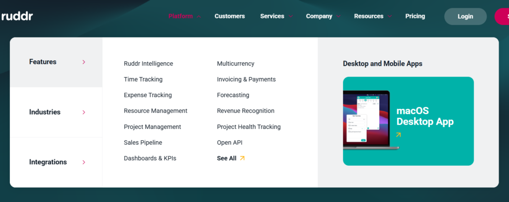
Navigation plays a significant role in reducing friction during the buying journey, and Ruddr performs well in this area.
The primary navigation is clean, well-organized, and structured around how potential customers naturally explore a SaaS product. Visitors can easily find information about the platform, services, customers, resources, pricing, and documentation without navigating through unnecessary menu layers.
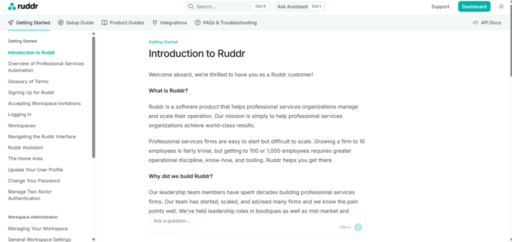
Beyond the homepage, Ruddr maintains a consistent structure across integration pages, customer stories, documentation, contact pages, and signup flows. This consistency helps visitors feel oriented as they move through different parts of the website and reduces cognitive effort.
One area that could be improved is the transition between the marketing website and the Help Center. Although the documentation is comprehensive, it introduces a noticeably different interface and navigation system. A more seamless visual and navigational experience would make the transition feel like part of a single product ecosystem rather than a separate destination.
Key Takeaways
✔ Simple and intuitive navigation
✔ Logical content organization
✔ Consistent structure across the website
✔ Easy access to important resources
Opportunity
Improve the visual consistency between the main website and the Help Center to create a more unified experience.
Product Demonstration
One of Ruddr’s strongest conversion assets is how effectively it demonstrates the product throughout the website.
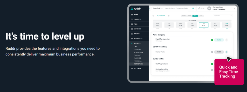
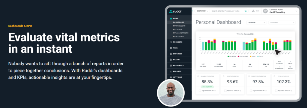
Rather than relying solely on written explanations, the site consistently pairs feature descriptions with dashboard previews, workflow visuals, and interface screenshots. This allows visitors to quickly understand what the platform looks like and how it fits into their daily operations.
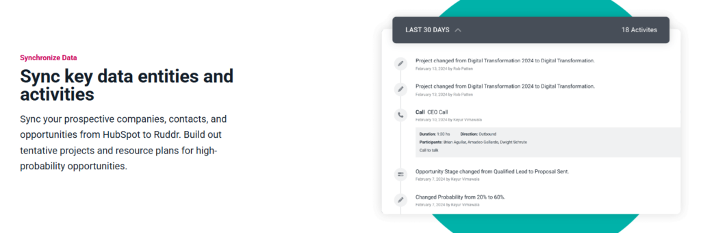
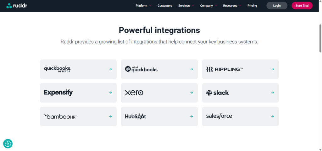
The integration pages are particularly effective because they combine product visuals with practical explanations of how data flows between systems. Instead of simply listing available integrations, Ruddr shows visitors how those integrations support real business workflows.
This approach reduces uncertainty, builds credibility, and helps potential customers visualize themselves using the platform before requesting a demo or starting a trial.
One opportunity for improvement would be to incorporate more interactive product experiences, such as clickable demos or guided walkthroughs. Interactive exploration can further reduce hesitation and help visitors experience the product before committing to a conversation with sales.
Key Takeaways
✔ Product visuals appear throughout the website
✔ Dashboard screenshots support feature explanations
✔ Integration pages demonstrate real-world workflows
✔ Visual demonstrations reduce uncertainty
Opportunity
Introduce interactive product tours or guided walkthroughs to give visitors a more hands-on understanding of the platform.

Trust & Credibility
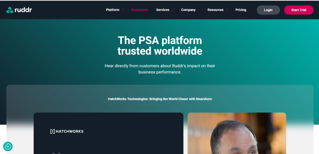
Trust is one of the strongest aspects of Ruddr’s website. Rather than relying on a single testimonial section, the site reinforces credibility across multiple touchpoints.
Visitors encounter customer success stories, detailed case studies, G2 recognition badges, integration partnerships, onboarding services, and a comprehensive knowledge base throughout their journey. Each of these elements helps answer a common buyer question: “Can I trust this platform with my business?”
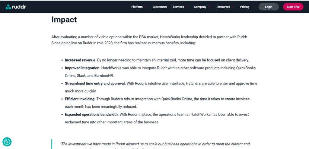
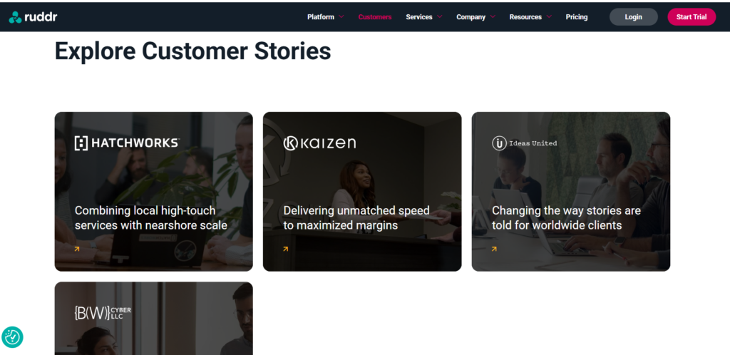
The customer stories are particularly effective because they go beyond generic testimonials. By presenting the customer’s background, challenges, implementation process, and measurable outcomes, Ruddr demonstrates real-world business impact instead of relying on promotional claims.
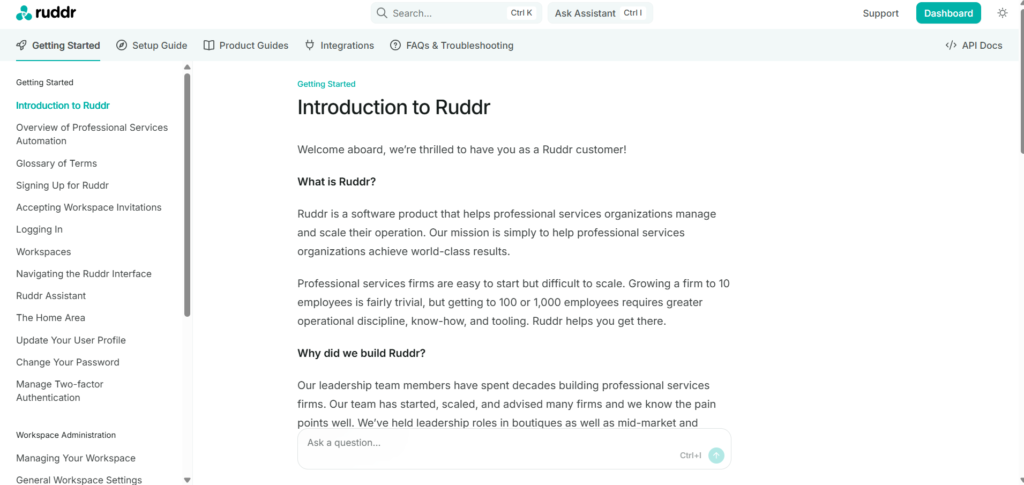
Another strength is the extensive documentation and support resources. For B2B buyers evaluating software, accessible documentation signals product maturity and long-term reliability.
Key Takeaways
✔ Detailed customer success stories
✔ Multiple trust signals throughout the website
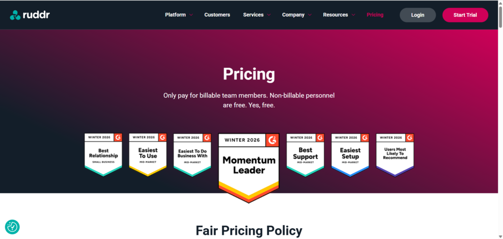
✔ Industry recognition through G2 badges
✔ Strong ecosystem of documentation and support
✔ Integration partnerships reinforce product credibility
Opportunity
While trust is well established, highlighting measurable customer outcomes such as revenue growth, time savings, or productivity improvements earlier in the buying journey would strengthen credibility even further.

Conversion Strategy
Ruddr follows a balanced conversion strategy that supports different stages of the buying journey rather than pushing every visitor toward the same action.
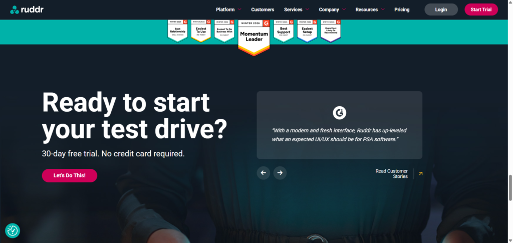
Throughout the website, visitors are consistently presented with opportunities to start a free trial, request a demo, explore integrations, read customer stories, or access documentation. This allows users to engage based on their level of purchase intent instead of forcing an immediate commitment.
The repeated placement of primary CTAs creates multiple conversion opportunities without making the experience feel overly aggressive. Whether a visitor lands on the homepage, an integration page, or a customer story, the next step is always clear.
One area that could be improved is the signup experience. The trial request form asks for company information before visitors have interacted with the product. Offering an interactive product tour or self-guided walkthrough before requesting business details could reduce friction for users who are still in the evaluation stage.
Key Takeaways
✔ Consistent CTAs across the website
✔ Multiple conversion paths for different buyer stages
✔ Clear progression from education to action
✔ Trial and demo options accommodate different preferences
Opportunity
Reduce signup friction by allowing visitors to explore the product through an interactive experience before requesting company information.
Supporting Pages Analysis
A common weakness among SaaS websites is that supporting pages receive far less attention than the homepage. Ruddr takes the opposite approach by maintaining consistency across its broader website ecosystem.
Instead of acting as standalone pages created solely for SEO or navigation, its integration pages, customer stories, documentation, and contact pages each contribute to building trust and moving visitors closer to conversion.
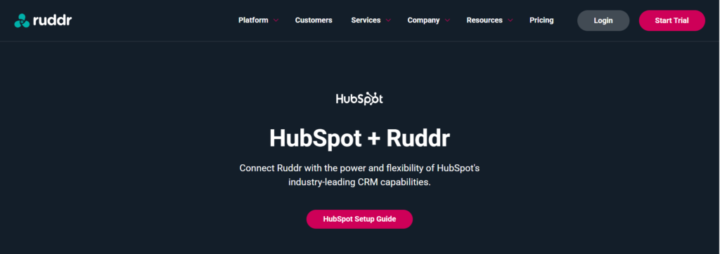
Integration Pages
The integration pages do more than announce compatibility with third-party tools. They explain how data moves between platforms, describe the business value of each integration, and reinforce product capabilities through screenshots and onboarding information.
This educational approach makes the pages valuable for both search engines and potential customers evaluating workflow compatibility.
Opportunity
Including short customer examples or workflow diagrams would make these pages even more compelling by demonstrating practical use cases.
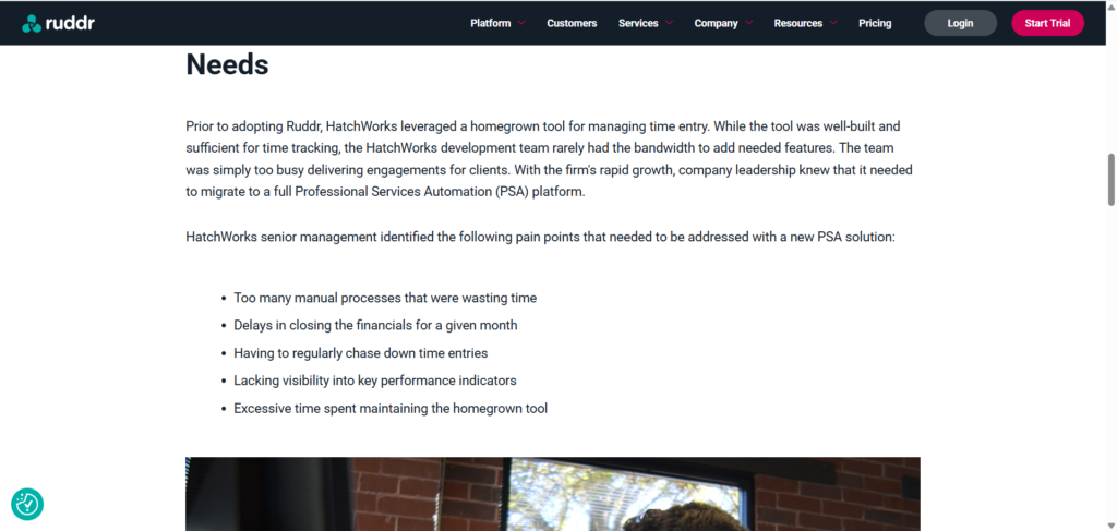
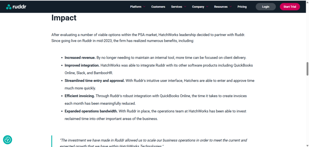
Customer Stories
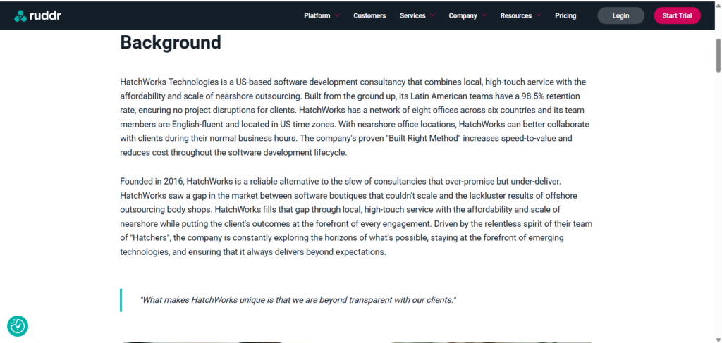
The customer stories follow a clear narrative structure, moving from background and business challenges to implementation and measurable outcomes. This storytelling approach is significantly more persuasive than relying on brief testimonial quotes.
By focusing on real business problems and results, these pages help potential customers visualize how Ruddr could solve similar challenges within their own organizations.
Opportunity
Surface key performance improvements such as efficiency gains or operational savings higher on the page to capture attention before visitors begin reading the full case study.
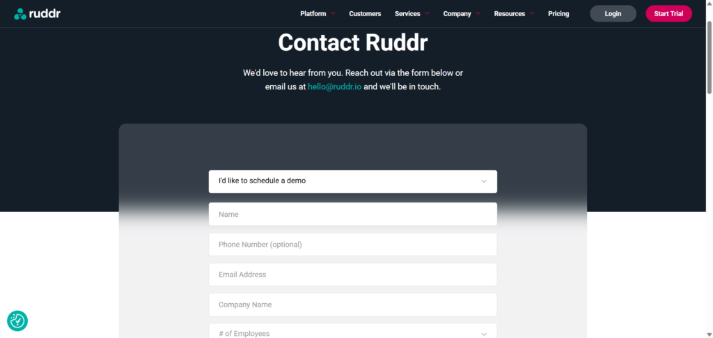
Contact & Demo Pages
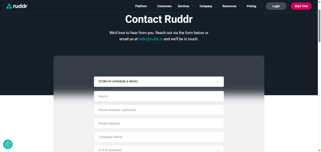
The contact experience is straightforward and removes unnecessary distractions. Visitors can quickly request a demo or contact the team without navigating through multiple pages.
However, the forms rely primarily on static fields. Including additional reassurance such as expected response times, customer logos, or a brief explanation of what happens after submission could reduce hesitation for first-time visitors.
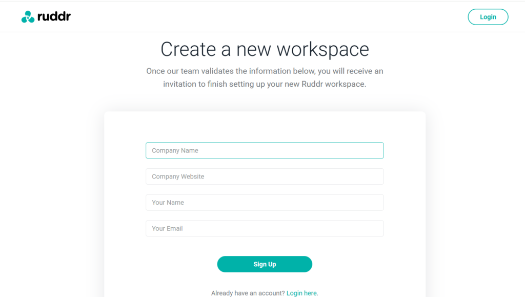
Signup Experience
The signup page is clean and visually simple, making it easy to complete. The form requests only essential business information, which keeps the process relatively lightweight for a B2B SaaS product.
That said, visitors receive limited context about what happens after submitting the form. Providing a short onboarding preview or outlining the next steps could make the experience feel more transparent and reduce uncertainty.
Documentation & Help Center
Ruddr’s documentation demonstrates product maturity by offering detailed setup guides, onboarding resources, and troubleshooting content. For prospective customers, this serves as another trust signal by showing that the platform is well-supported beyond the initial purchase.
The primary opportunity lies in aligning the visual identity of the Help Center more closely with the marketing website. A more seamless transition would reinforce the feeling of a single, cohesive product experience.
What Ruddr Does Exceptionally Well
Every website has opportunities for improvement, but the strongest websites also provide valuable lessons. Ruddr succeeds because it creates a consistent buying experience across the entire website rather than relying on its homepage alone.
1. Maintains Consistency Across Every Page
Whether visitors explore the homepage, integrations, pricing, customer stories, or documentation, the visual identity, messaging style, and calls-to-action remain consistent.
This consistency builds familiarity and reduces cognitive effort as buyers move deeper into the website.
2. Demonstrates The Product Instead of Describing It
Throughout the website, Ruddr supports nearly every important message with dashboard previews, workflow examples, and interface screenshots.
Visitors rarely have to imagine what the platform looks like.
3. Educates Before Selling
Instead of pushing visitors directly toward a demo, Ruddr provides multiple ways to learn:
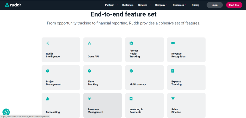
- Feature pages
- Integration pages
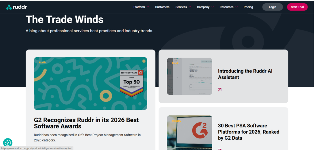
- Blog articles
- Customer stories
- Documentation
This builds confidence before asking visitors to make a buying decision.
4. Strong Information Architecture
The navigation, content organization, and supporting pages make the website easy to explore.
Visitors can answer almost every important buying question without feeling lost.
5. Trust Is Reinforced Continuously
Rather than placing testimonials in one section, Ruddr distributes trust signals throughout the website using customer stories, integrations, onboarding services, documentation, and consistent product visuals.
That creates confidence over time rather than relying on one persuasive moment.
⭐ Overall Observation
One of Ruddr’s biggest strengths isn’t any individual page, it’s how consistently every page supports the buying journey.
Highest-Impact Conversion Opportunities
Ruddr already provides a strong website experience. The following recommendations focus on increasing clarity, reducing friction, and making the value proposition easier for first-time visitors to understand.
1. Lead With Stronger Business Outcomes
Impact: ⭐⭐⭐⭐⭐
Difficulty: ⭐⭐☆☆☆
Several pages explain product capabilities before reinforcing the business outcomes they create.
Bringing outcomes like profitability, utilization, forecasting accuracy, and operational efficiency closer to the top of key pages would strengthen the value proposition.
2. Strengthen Product Differentiation Earlier
Impact: ⭐⭐⭐⭐☆
Difficulty: ⭐⭐☆☆☆
Visitors understand what Ruddr does fairly quickly.
However, the website could communicate earlier why Ruddr is the preferred choice compared to other Professional Services Automation platforms.
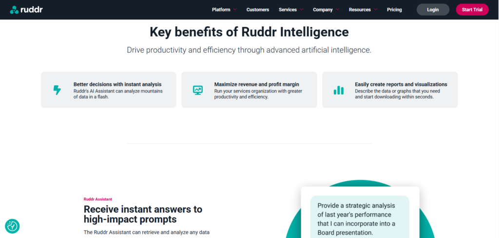
3. Reduce Cognitive Load On Feature-Rich Pages
Impact: ⭐⭐⭐⭐☆
Difficulty: ⭐⭐⭐☆☆
Some pages introduce many capabilities within a short scroll.
Grouping related features around business outcomes would make the information easier to process.
4. Surface Customer Results Earlier
Impact: ⭐⭐⭐☆☆
Difficulty: ⭐⭐☆☆☆
Customer stories contain valuable outcomes, but readers often need to scroll before seeing measurable business results.
Moving those metrics higher would strengthen first impressions.
5. Make Trial Expectations More Explicit
Impact: ⭐⭐⭐☆☆
Difficulty: ⭐☆☆☆☆
The signup experience would feel more reassuring if visitors immediately understood what happens after submitting the trial request.
Setting clear expectations reduces uncertainty before conversion.
Overall Observation
These recommendations don’t require a redesign. Most involve improving clarity, reinforcing differentiation, and helping buyers reach confidence faster.
Key Lessons For SaaS Founders
Every website reviewed in this series offers practical lessons that extend beyond a single company. Here are the biggest takeaways from Ruddr’s approach.
📦 Lesson 1
Build A Website Ecosystem, Not Just A Homepage
Great SaaS websites don’t rely on a single landing page. Every supporting page should contribute to building trust and helping buyers make informed decisions.
📦 Lesson 2
Show Your Product Early And Often
Product visuals reduce uncertainty far more effectively than long feature descriptions.
Whenever possible, demonstrate the experience instead of explaining it.
📦 Lesson 3
Educate Before Asking For Commitment
Feature pages, customer stories, documentation, and blog content all help buyers build confidence before requesting a demo.
📦 Lesson 4
Keep Navigation Consistent
As websites grow, maintaining a predictable navigation structure becomes just as important as adding new content.
Consistency reduces friction.
📦 Lesson 5
Every Page Should Move Buyers Forward
Whether it’s a pricing page, integration page, or help article, every page should answer questions, reduce hesitation, and naturally guide visitors toward the next step.
Final Thoughts
Ruddr demonstrates that strong conversion isn’t created by a single headline or CTA. It’s the result of a well-connected website where messaging, product demonstrations, educational content, and trust signals work together to support the buyer’s decision at every stage.
Final Scorecard
Ruddr demonstrates what happens when a SaaS website is treated as a connected buying experience rather than a collection of individual pages.
Here’s how the website performs across the core areas evaluated in this breakdown.
Messaging & Positioning
⭐ 8.5 / 10
Clear audience positioning and consistent messaging, with an opportunity to communicate differentiation and business outcomes earlier.
Information Architecture
⭐ 9.3 / 10
A well-organized website ecosystem that makes product, pricing, integrations, customer stories, and educational resources easy to explore.
Product Demonstration
⭐ 9.4 / 10
Strong use of product screenshots and workflow examples helps visitors understand the platform before starting a trial or booking a demo.
Trust & Credibility
⭐ 9.2 / 10
Customer stories, G2 recognition, integrations, documentation, and onboarding resources consistently reduce buyer uncertainty.
Conversion Strategy
⭐ 8.7 / 10
Multiple conversion paths support visitors at different stages, although greater transparency around the trial process could reduce friction.
Overall Buying Experience
⭐ 9.1 / 10
A cohesive and credible website experience that supports buyers from initial product discovery through deeper evaluation.
Final Verdict
Ruddr’s greatest strength isn’t one exceptional headline, page, or call to action.
It’s the way the entire website works together.
The homepage creates initial interest. Feature and integration pages deepen product understanding. Customer stories provide evidence. Documentation and onboarding resources reduce risk. Pricing, trial, and demo pages give buyers multiple ways to move forward.
That connected experience is what makes Ruddr’s website effective.
The biggest opportunities aren’t about redesigning the website. They’re about sharpening the value already there: communicating business outcomes earlier, making differentiation more immediate, surfacing customer results faster, and reducing uncertainty around conversion points.
The biggest lesson from Ruddr is simple: a strong SaaS website doesn’t rely on one page to convert buyers. Every page should help them make the next decision.
What Is Your Website Helping Buyers Decide?
Your homepage may create the first impression, but buying decisions are shaped across the entire website.
Messaging, product pages, pricing, proof, navigation, and conversion paths all influence whether qualified visitors keep exploring or leave with unanswered questions.
A Website Conversion System identifies where that journey breaks down and shows how to make every key page work together to build confidence and move buyers forward.